

Have you ever seen a design that looked stunning — but turned out hard to read for older people?
Or a beautiful color palette, but one that’s not friendly for people with color blindness?
Creativity is important. But in today’s world, accessibility and inclusivity are non-negotiable.
Design isn’t just about looking good — it’s about making sure everyone can experience it fairly.
As digital creators, we are no longer just artists or communicators — we are builders of experiences. And those experiences should be designed with people in mind — all people.
This article will explore why inclusive design matters, and simple steps to help you create more accessible, equitable work for all.
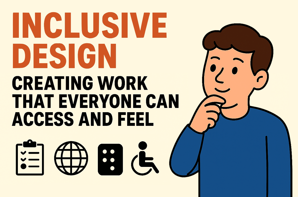
🌍 What Is Inclusive Design?
Inclusive design is an approach that considers diverse user backgrounds —
age, gender, disability, culture, language, even access to technology.
It’s not a trend or a box to check — it’s a mindset.
The goal isn’t to create for the “average user,”
but to accommodate as many needs and situations as possible.
After all, there is no such thing as an average human being. Everyone experiences the world differently — and your design should respect that.
Rather than treating edge cases as exceptions, inclusive design brings them into focus from the start. When done right, it removes barriers and invites more people to engage with your work fully.
⚠️ The Risks of Non-Inclusive Design
Design that excludes — even unintentionally — sends a message:
“You’re not the audience we’re thinking of.”
Here are a few common examples:
• Websites that blind users can’t access due to lack of alt text
• Promo texts that are too small and low in contrast, making them unreadable for elderly viewers
• Symbols or colors that carry different (even offensive) meanings in other cultures
• Gender-biased copy like “Real men wear this”
• Artistic fonts that confuse people with dyslexia
These aren’t small mistakes — they’re design failures that hurt people.
And in the long run, exclusive design alienates users, reduces reach, and damages trust in your message or brand.
Think of it like this: If your message is powerful but can’t be accessed, it loses impact.
Design that excludes is like a locked door with no key.
🧠 Core Principles of Inclusive Design
Let’s break down the heart of inclusive design into four main principles:
1. Accessibility First
Design should work for users with visual, auditory, motor, or cognitive challenges.
Examples:
• Use strong color contrast between text and background
• Add alt text to all images — not just decorative ones
• Ensure text remains readable when zoomed in or viewed on various devices
• Avoid overly decorative fonts for body text
Think beyond aesthetics. Think function. If people can’t access your message, the visuals won’t matter.
Accessibility also means ensuring your content is keyboard-navigable, screen reader–friendly, and doesn’t rely on motion or flashing elements that could cause seizures or discomfort.
2. Cultural Sensitivity
Symbols, colors, or phrases may mean different things in different cultures.
Examples:
• White = purity in the West, mourning in East Asia
• The “OK” hand sign = positive in one country, offensive in another
Colors and gestures are not universal. Neither is humor, idiomatic language, or even imagery.
Always research your audience, especially for international campaigns.
Localization is more than translation — it’s empathy in cultural context.
Even visual metaphors like lightbulbs for ideas or pigs for savings might not resonate or may offend in certain cultures.
3. Inclusive Language
Use wording that is friendly, gender-neutral, and free from stereotypes.
Examples:
• Replace “She’s pretty for a woman designer” → with “She has a strong visual style.”
• Avoid clichés like “pink for girls,” “blue for boys”
Language shapes perception. What you write can either include or exclude.
Be mindful of the words you choose.
Write in ways that reflect a range of human experiences — not just your own.
If your copy speaks to everyone, it will reach further and connect deeper. Inclusive language isn’t about being politically correct — it’s about being human-centered.
4. Include Diverse Feedback
Test your designs with a variety of people, not just fellow designers.
Get input from older adults, wheelchair users, students, people in areas with poor internet access — real-world perspectives matter.
User testing with diverse groups helps you uncover blind spots you didn’t know you had.
Sometimes, what works in a high-speed city with modern devices doesn’t translate well in rural areas or developing countries.
Even small observations — like button placements or swipe directions — can affect usability across different audiences.
🛠️ Practical Ways to Make Your Design More Inclusive
You don’t have to reinvent your workflow. Small changes go a long way.
• Use clean sans-serif fonts (Arial, Inter, Helvetica)
• Minimum body text size: 16px
• Avoid using red and green together (color blindness issue)
• Offer high-contrast versions for users with low vision
• Add text descriptions to illustrations or infographics
• Include captions/subtitles for animated videos
• Use universal icons that are free of cultural/gender bias
• Avoid text-only pastel colors on light backgrounds
Also:
• Avoid relying solely on color to communicate meaning (e.g., don’t just use green = success, red = fail — include symbols too)
• Create responsive layouts that adjust well on different screen sizes and resolutions
• Avoid auto-playing media that cannot be paused or muted
Start with accessibility checklists (like WCAG) as a baseline. But go beyond the checklist — talk to real people, observe real usage.
✍️ Case Study: Inclusion in a Social Campaign
In a disability awareness campaign, Graptail Studio’s design team created illustrations with diverse characters:
• A main character with a hearing aid
• A visually impaired figure with a cane
• Simplified poster language for easier understanding
The result?
The campaign didn’t just look “pretty” — it felt genuine and had real impact for the communities it aimed to support.
By representing different abilities and needs visually and linguistically, the design spoke directly to groups that are often overlooked.
It turned passive awareness into meaningful representation.
In feedback surveys, people said they felt seen — a powerful reminder of what inclusive design can do.
📈 Why Inclusive Design Benefits Everyone
Sometimes, people assume inclusive design is just for people with disabilities.
But in reality, everyone benefits.
• Reaches a wider audience
• Strengthens your brand or personal image
• Improves conversion (clearer messages = more action)
• Provides a lasting, positive experience
• Builds empathy and value into the work itself
• Future-proofs your content for evolving user needs
• Makes content usable in noisy, busy, or low-bandwidth environments
• Reduces support requests caused by unclear or inaccessible designs
Consider captions on a video. Originally meant for hearing-impaired users, they’re now widely used by people in loud places, quiet offices, or different language backgrounds.
Inclusive design creates smarter, more resilient work.
It pushes you to think broader — and in doing so, creates stronger, more human solutions.
Final Thought
Inclusive design isn’t just “a nice to have.”
It’s a responsibility — especially for designers who want their work to be felt, not just seen.
As creators, our job is to remove friction, not add it.
To connect, not to gatekeep.
Inclusive design challenges you to ask better questions:
Who is being left out?
Who is being misrepresented?
What assumptions are we making?
Design with empathy. Create with intention.
Because the best design is the one that makes everyone feel included.